Mobile-friendly landing pages have become vital in the online marketing ecosystem. These days having a landing page is not enough to get new customers. A business needs to customise its user experience according to the consumers’ requirements.
Various studies have shown that mobile devices are responsible for 60% of website visits.
It means, if you haven’t optimised your landing page for smaller screens, you might be losing a lot of good leads.
In this article, we will highlight the top benefits and tips that every online business should know for gaining higher conversions by optimising their landing page for mobiles.
What are Mobile-Friendly Landing Pages?
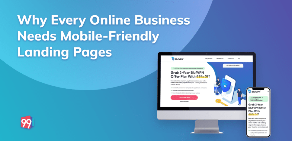
A mobile-friendly landing page is a specialised page built for smartphone users. Such landing pages are not a slim copy of the website versions but get designed to elevate the mobile user experience.
Due to a reduction in screen size, mobile landing pages have limited content options. The development of every element used in a mobile-friendly landing page needs to be in coherence with the following:
- Easy to navigate with a single hand
- No overlapping of page elements
- Large clickable buttons and links
A mobile landing page and website landing page aim to motivate visitors to perform an action. But by creating specific landing pages for smartphone users, you can increase your chances of earning quality leads. There are many significant advantages of using mobile-friendly landing pages; let’s discuss some of them in detail.
Benefits of Mobile-Friendly Landing Pages
In 2015, Google announced mobile-friendliness as a positive ranking signal. Google made this decision because of the increasing traffic from smartphones-users.
So, whether you are creating a digital marketing landing page or a lead generation landing page, you must develop two versions, one for the website users and one for the mobile device users.
But good SERP rankings are not the only benefit you will receive for optimising your page for mobile devices. Other related benefits include:
- Easy to Access
Many studies have highlighted that 61% of consumers are more likely to buy from mobile-friendly sites.
It is so because customers can easily access your offers from their smartphones and place their orders without going through the trouble of opening their desktop.
Creating a seamless user experience is the goal of every business. A mobile landing page makes it easier for brands to communicate with their audience.
- Boosts ROI
Most of the time, a visitor arrives at your landing page by clicking on a paid campaign. But did you know that “52% of PPC clicks come from mobiles.”
By investing in a mobile-friendly landing page, you can decrease your bounce rate and capture more leads. It also helps in creating a positive brand identity and creating a lasting impression on the target audience.
- Streamlines Consumer Engagement
Mobile-friendly landing pages allow you to engage your visitors on time with the help of its concise format and easy navigation. Unique features like click-to-call buttons, sticky CTA buttons, and faster-loading speed make a mobile-responsive landing page the perfect tool to cater to the audience’s short attention span.
By effectively streamlining your brand’s presence on smartphones, mobile-responsive landing pages ensure that you get maximum traction and generate strong leads.
Tips for Creating a Mobile-Friendly Landing Page
Building a mobile-responsive landing page can take a lot of time if you don’t understand your mobile audience. It is crucial to consider the channels and locations through which the target audience reaches your mobile landing page. Creating personalised experiences for smartphone users sets your brand apart and boosts conversions. With the help of mobile metrics, you can draw out better buyers’ journeys for your small-screen audience.
Some other tips that can help you in creating mobile-friendly landing pages are:
Creating an Effective Design
Compared to desktop landing pages, the mobile versions have less space which calls for more creativity. You need to carefully plan the design of the landing page so that it highlights your USPs and grabs customer attention.
There are three elements you need to focus on for creating an effective landing page design for your mobiles:
- CTA Button: Place the call to action button at the top of the landing page will help in making the visitor aware of your offer the minute they enter the landing page.
- Copy of the Landing Page: Keep the copy of your landing page short and precise. Try to start with a headline that brings your services to the spotlight. Showcase benefits with the help of bullet points and short paragraphs to save space.
- Form Fields: Long forms are the last thing you want to put on a mobile landing page as they can overwhelm the visitor and increase a page’s loading speed. Keep the form fields as minimal as possible to motivate visitors to fill them up.
Making Navigation Easier
A clean visual hierarchy makes the navigation of a mobile landing page easier. Using a single column layout gives the mobile landing page a clean look and makes it easier to navigate.
Other elements you can use are:
- Click to call buttons: Such buttons help in connecting with your audience directly and help in creating an ideal customer experience.
- Sticky menus: These menus allow the visitor to easily jump to the sections of the landing page they find interesting. It assists the visitors to find what they are looking for faster.
Fast Page Loading Speed
A page’s loading speed is like make or break deal for visitors. Several studies by Google have shown that the bounce rate increases by 32% if the page’s loading time increases from one to three seconds.
So it becomes highly crucial to optimise your mobile landing page for speed. You can use Google’s PageSpeed Insights to check your page’s loading speed.
Using fewer visuals, small size images, and a short copy are some of the ways through which you can decrease the loading speed of your mobile responsive landing page.
Conclusion
A mobile-friendly landing page helps an online business outreach its target audience through all available channels. It provides various advantages to marketers that they can use for creating great consumer experiences.
By understanding the differences between a desktop and mobile landing page, you can create pages that answer your customer requirements and provide them with timely solutions. With the tips mentioned in this article, you will be able to develop optimised mobile-friendly landing pages that generate a positive impact on your audience.
If you are looking for landing page templates that are optimised for both mobile and desktop, then the 99 Landing Pages can help you. Check out our inventory to explore a rich collection of exclusive landing page templates built specifically for different offers.
Other Interesting Reads:
5 Restaurant Social Media Marketing Ideas to Drive More Customers
5 Proven Strategies For Lead Generation in Higher Education
Our Featured Templates: