Webinars have become the modern way of connecting with your audience and a webinar registration landing page has become equally crucial.
By using the traditional boring registration page for your webinar, you will not get the number of sign-ups you might be expecting.
Here, a webinar registration landing page can accurately represent your webinar’s aim and you.
But for that, you need to understand the key elements of an effective webinar landing page.
The Structure Of A Webinar Registration Landing Page
Every webinar registration landing page follows a structural pattern to ensure that your message gets delivered to the visitors. A well-defined structure creates a visual hierarchy that is clear in its CTA.
For creating or identifying such registration page templates, below is a list of elements you should focus on:
- 1. Headline
- 2. Date and Time
- 3. Sign-up Form
- 4. Brief About the Webinar
- 5. State The Benefits
- 6. Introduction to the Speakers
- 7. Event Breakdown
- 8. Final CTA
1. Headline
Headline decides whether your potential client will go through the whole landing page or not. One of the best recipes for creating a magnetic heading is to focus on the questions the hosts will be discussing.
For example, many educational institutions are looking for 24/7 online services for their students these days. Using such pain points and targeting this in your headline can intrigue your visitor and motivate them for a sign-up.

2. Date and Time
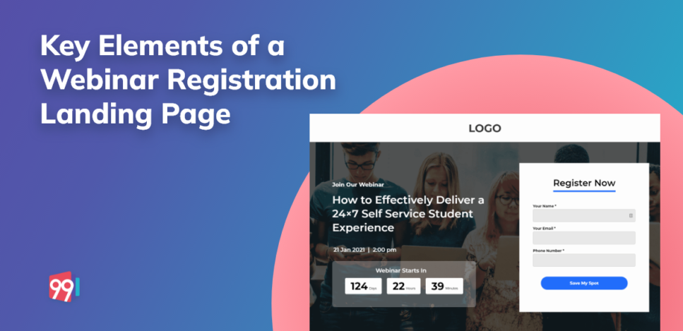
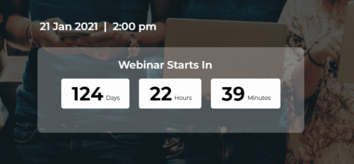
Yes, you have to place your date and time right after your main heading. The prime advantage is that the schedule becomes easier to locate on the landing page.
As done in our webinar landing page template, you can also create urgency by integrating a countdown for your webinar’s date.
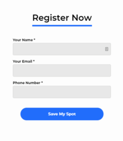
3. Sign-up Form
Less is always more when it comes to building the form of your webinar registration landing page. Try to ask as limited information as possible from your visitor.
Long forms are highly overwhelming and shadow your whole landing page. Keep in mind that you are trying to generate leads here and not just creating a database, so keep the field forms short, simple, and quick.
As you can see in this lead form, the heading ‘Register Now’ creates an urgency, followed by only three fields to fill. Also, notice the alignment of the columns; it is vertical. This pattern makes the form user friendly and takes less time to fill up.
The last is the CTA button ‘Save My Spot’. Using a first-person voice helps in making the reader feel more in control of the whole registration process.
4. Brief About The Webinar
Webinar descriptions make the audience more aware of your motives behind organising the whole event. Try to concisely explore the central theme of your webinar with short sentences divided into small paragraphs.

Here in the above example, the description is easy to read and provides valuable information about the webinar’s subject.
Another way of showcasing the webinar description is through bulleted points. Below is an example of how you can use design to make your bullet point presentation more impactful.
5. State The Benefits
Your benefits must be right after your webinar description. As the visitors have recently read the brief about your webinar, they will understand its benefits better.
While writing your webinar benefits, keep your buyer’s persona in mind.
You can again use the bulleted point method here, as discussed in the above section.
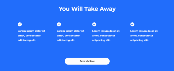
Above is an example of how you can showcase your webinar benefits in a simple yet effective way.
We have used the CTA ‘Save My Spot’ here as well to trigger repetitive messaging.
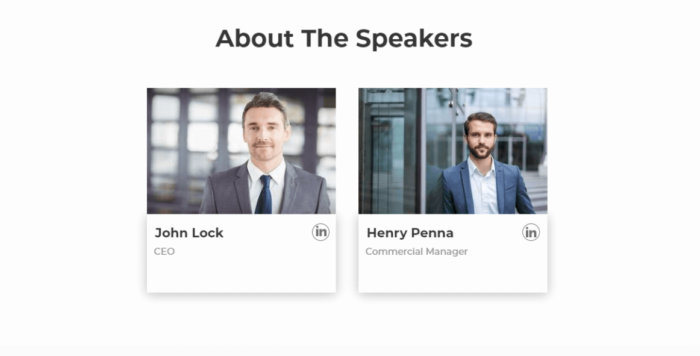
6. About Speakers and Hosts
A quick introduction to your speakers and hosts will help make the audience more familiar with your experts. You can state their job profile, years of experience, area of expertise, and awards and recognition in their intro briefs, along with a clear headshot.
This information helps in establishing credibility and creating a bond between your audience and speakers. In the below example, the details about the speakers are mentioned in a concise and clear format.
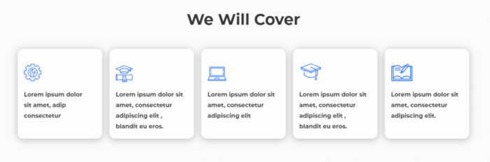
7. Event Breakdown
Event breakdown implies sharing the exact schedule of the webinar with your audience.
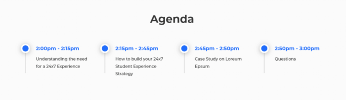
In the above example, taken from our webinar landing page template, you can see the accurate representation of the topics and the timings of the discussion. This way, the prospects get a detailed view of what they can expect from the event.
Visitors who don’t have the time to attend the whole event but are interested in some of the sub-topics that the webinar will have can quickly go through the breakdown and join the webinar when their choice of topic starts.
This way, an event breakdown can increase your conversion rate.
8. Final CTA
Final CTA is an easily accessible button at the end of your landing page that repeats your message and makes it more recognisable.
After progressing through the whole landing page, a clear CTA at the end acts as the final push your visitor needs for signing up.
Some Bonus Tips
- Try to keep the colour theme of the landing page in coherence with your brand as it triggers a familiarity within the audience in the long run.
- When putting your logo at the top of your webinar registration landing page, do not link it to your website.
- The CTA buttons should stand out from the whole landing page. For this, you can use a bold colour for your CTA that contrasts with the entire colour theme of the landing page.
- If you buy a landing page template, always check whether it is available in both desktop and mobile versions.
- Do not forget to add a thank you page at the end of a sign-up, and it leaves the prospects with a positive impression.
Conclusion
Now you better understand the critical elements to look for while on your hunt for a perfect webinar landing page. With effective integration of these elements, you expect a better conversion rate and secure good quality leads.
If you are looking for an easy to customise webinar landing page template, we have just the right one for you. Explore our webinar registration landing page template and boost your sign-up rate.
Some other blogs for more inspiration:
What To Do After Buying A Lead Generation Landing page Template
Mobile-Friendly Landing Pages: Why Every Online Business Needs Them
Boost Your Firm’s Growth with Smart Accounting Ads Strategy