In inbound marketing, following SaaS landing page best practices is a great way to increase your chances of achieving your conversion goals. SaaS businesses must understand that for generating leads, it is essential that the consumers know exactly what the brand is selling. Blurry visuals, bulky paragraphs, and overloaded landing pages or websites are not the answer to getting better leads.
Impactful landing pages are simple and convert the brand’s message into a direct and concise format. When it comes to SaaS marketing, the goal should be to get potential customers through the door as quickly as possible. According to stats, the conversion rate of SaaS companies is 7%.
In this blog, we will discuss the SaaS landing page best practices that readily apply to every SaaS. Through examples, we will explore the common qualities of successful SaaS landing pages.
Things to Keep in Mind for SaaS Landing Page Designs
Before we dive into examples, we must understand some basic SaaS landing page best practices.
- Keep Your Page Clean and Simple
The first step in creating an effective SaaS landing page is to keep it clean and simple. Use sleek visuals that are easy on the eyes, and focus on one main message. Avoid clutter and unnecessary text, which can confuse visitors and prevent them from converting. - Ensure Clear Cues About What You’re Selling
Your landing page should clearly communicate what you’re selling. Indicate how much you’ll cost, what features are included, and how soon customers can start using your product or service. Without a clear roadmap, potential buyers may become lost and decide against signing up for your offer. - Make it Easily Accessible
Make sure your landing page is easy to find and navigate. Include clear calls-to-action at the top of the page and essential information about pricing, features, or how to sign up for your program. Keep everything organised so visitors can quickly find what they’re looking for.
SaaS Landing Pages Best Practices: Examples
1. Office Solver
One of the biggest problems on landing pages is information presented in a clumsy format. It is highly unattractive and makes the visitor press the backspace key. Office Solver‘s landing page tackles this issue with utmost elegance.
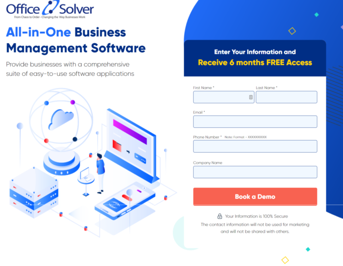
Office solver is an all-in-one software suite that helps businesses run efficiently, which is well-emoted by the headline and subheadline of the landing page. The designers have efficiently highlighted the offer of ‘free access for six months at the top of the form, which acts as a motivator for form completion to visitors.
Standing out Elements:
- FAQ Section: One of the SaaS landing page best practices is to include an FAQ section on the landing page. A SaaS can often confuse many people and leave them with questions. By jotting down the common prospects’ common queries, SaaS companies can improve the buyers’ journey. Office Solver has rightly executed this on their landing page.
- USPs Highlighted: Be it above, middle, or at the end of the fold, different USPs have been highlighted in all the sections of the landing page. This practice reiterates the importance of SaaS.
2. MemberMeister
Leveraging the right elements at the right places is crucial to SaaS landing page best practices. The flow of the content can make or break the deal. MemberMeister‘s choice of design presents the best of its brand to the visitor.
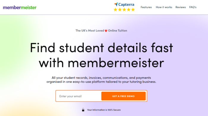
It is a SaaS that keeps track of all the tasks, details, and payments for a tutoring business. They have an FAQ page, a to-the-point CTA, and a great copy to cultivate visitor attention and make them stay till the end of the page. The images on the landing page showcase the SaaS in-action, which helps prospects visualise how it works.
Standing out Elements:
- Social Proof: Word-of-mouth marketing has a digital name now, and marketers call it social proof. The MemberMeister page has effectively utilised customer testimonials and reviews to generate prospect confidence in their brand.
- Single Field Form: Too many field forms asking for personal information can look like too much work to visitors and invade privacy. They might skip filling out the form. Limiting the form fields can make the registration process easier and more transparent. MemberMeister has used just one form field, but if you require more information from the prospects, then go for a multi-step form.
3. ResponseIQ
If you want a landing page example that is short and simple but checkmarks all the SaaS landing page best practices, then you should pick ResponseIQ. It is a SaaS tool that offers easy-to-use call tracking services to businesses to communicate seamlessly with their clients.
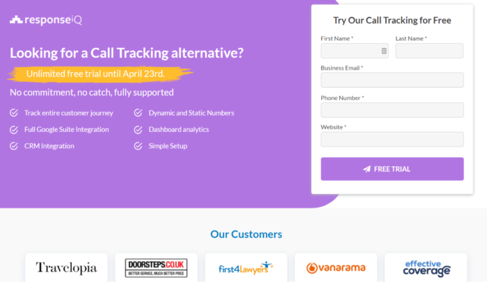
The SaaS landing page uses an offer and social proof to catch visitors’ attention. The CTA again highlights the offer of a free trial to repeat the message.
Standing out Elements:
- Videos: Video is an excellent way to persuade potential customers to convert to your SaaS landing page. Short but powerful videos that highlight key features of your product or service, explain why they’re valuable and show how easy it is to use them right away work great. If you can create an emotional connection with viewers, chances are they’ll take action – whether that’s signing up for a trial or buying your product outright. ResponseIQ uses two videos to get its point across.
- Case Study: Case studies are a detailed walkthrough of how your SaaS solved a client’s problem. ReponseIQ has used a video format to showcase its case study, making it easier for visitors to understand how the SaaS solves a particular problem. It is an excellent way of highlighting the value of a SaaS tool.
4. Purply
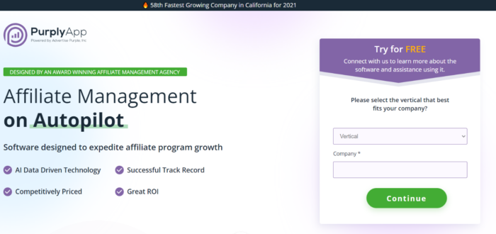
An impactful landing page establishes a positive brand image and convinces customers to sign-up. Purply’s landing page has all the elements that fulfil such requirements. It is a SaaS that offers easy affiliate marketing. The colour palette on the landing page coincides with the brand’s colours. The CTA is present at every fold of the landing page to generate interest.
Outstanding Elements:
- Multi-step form: A multi-step form is a great SaaS landing page practice as it does not overwhelms the prospect with too many questions. But gets the job done by obtaining information through shorter step-by-step forms. Purply has cleverly used it on its landing page to get more conversions.
- Transparency: Creating a separate section for how a SaaS tool works make it easier for the audience to understand how they can use it. Purply has highlighted the process of how easy it is to use its SaaS, which can motivate potential buyers to sign-up.
Conclusion
Landing pages are an essential part of any online marketing campaign – and saas landing pages are no exception. Following simple SaaS landing page best practices, you can create a page that leads potential customers straight to your product or service. Make sure to include clear calls to action, organise critical information clearly, and use video to create an emotional connection with viewers. With a little effort, your saas landing page will fulfil your marketing goals.
Read More
Types Of Paid Advertising You Should Know About
Lead Generation For Nonprofit Organisations: Complete Guide


