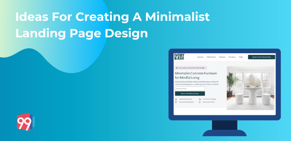
A minimalist landing page design delivers a brand’s message in a precise format while enticing consumers with rightly placed elements. Due to the popularity of minimalistic landing page designs, marketers have realised that including non-essential components in landing pages does not work.
In this blog, we will share some tips for designing a minimalist landing page. Marketers can use the tips to improve landing pages and enhance conversion rates.
Understanding Minimalist Landing Page Designs
Excessive design elements such as useless stock images, textured backgrounds, muddled navigation, social buttons, and blog post links divert attention away from our landing page’s primary aim: generating leads. Rather than adding more features and options, many marketers have started simplifying the designs.
A minimalist landing page helps in bringing this simplification.
Minimalism is the deliberate promotion of the things we value most and eliminating anything that distracts us from them. It advocates clarity, purpose, and simplicity, all essential elements for a landing page.
In a minimalist landing page, businesses design everything intentionally. The main aim of a minimalist design is to promote and support the marketer’s desired primary action for the visitor.
But creating a landing page that has minimum elements but maximum conversions can be confusing sometimes. So we will share with you four tips on creating the most effective minimalist landing page designs, which can create impact and generate quality leads.
Tips For Creating A Minimalist Landing Page
For creating a landing page that has a minimalistic design, you have to handle its elements carefully. Companies should only utilise the elements of a landing page that help make the buyer’s journey easier. Follow the below tips for designing a minimalist landing page.
1. Font Choice
Due to this reason, every component of your landing page becomes crucial as it has to get adequately utilised to attract visitor attention. Here, using the correct font and font size becomes essential.
You can use one or two font families to generate an overall visual of an appealing landing page while highlighting the advertising campaign’s key points. Then, the font size can get used to establish a visual hierarchy on the landing page, making the navigation through the page more accessible.
2. Optimise the Text
For a minimalist landing page design, companies must avoid big text blocks. Decrease the content on the landing page by replacing it with bullet points that efficiently point out the USPs of the services offered. Frame the copy of the landing page in a manner that delivers the relevant message concisely.
Designers can also opt for infographics with a balanced image and text combination to attract consumer attention.
3. Colour Scheme
The colour scheme for your landing page must match the theme of your design and its primary message. It is not mandatory to choose bright colours if they do not match up with the tone of your landing page.
For a minimalist landing page design, the driving colour is used as a background texture to support the content of the landing page. To create lasting impressions, you can also use high-contrast colours like blue and red that look distinct when set against each other.
4. Imagery Content
When many illustrations are present on a landing page, they all compete with the content and CTA for attention. The main goal of a minimalist landing page is to reduce this competition and only use essential components on the page. But this does not mean that you cannot use images to enhance the visuals of your landing page.
A graphic employed in a well-thought-out manner can serve as the focal point and help create a better topography for the landing page. You can experiment with different images in your background or front and figure out what works best for you and your audience.
5. Balancing
Creating a balance between all your landing page elements should always be a pivotal point to keep in mind while designing the page. When employing a bold element, it must get balanced out with a light element to establish harmony in the minimalist design. For example, some landing pages innovatively use darker and lighter shades to create a balance on their pages.
Similarly, you can use graphics, space, and other elements to curate one of the best minimalist landing page designs for marketing campaigns.
6. Make It Apt for Mobile
A minimalistic design approach should not be limited to desktop landing pages. Companies must also implement such designs for small screen devices like mobiles and tablets. The rules of minimalistic design are the same for both types of devices. The only difference is that for a smaller screen setup, a designer must become more careful while planning and placing the landing page elements.
For devices like mobile, designers follow a single layout form. A minimalistic design for mobile devices must have minimal text, a compelling CTA, and images to support the overall design. Keep in mind to keep the size and number of images in check to avoid increasing the page load speed.
Conclusion
A minimalist landing page design works on the principle of ‘less is more. It is one of the most refined ways of attracting prospective customers and guiding them toward the CTA. The best approach to making a minimalist landing page is to focus on the elements that highlight the services. How a product or a service solves consumer problems and what value it provides should be the star content of a landing page.
If you are interested in exploring and buying landing page designs that are minimalistic and apt for desktop and mobile screens, check out the landing page templates by 99Landing Pages that are exclusively conversion-focused at 99Landing Pages.
Similar Blogs:
5 Product Landing Page Ideas to Increase Your Conversion Rates
SaaS Landing Page Best Practices With Examples
Our Featured Templates:


