Have you ever wondered how a single product website can capture an audience’s attention, ignite curiosity, and lead them down a purchasing path? Picture this: you enter a boutique store selling only one unique item. Your focus isn’t divided among multiple products. Instead, every inch of your attention is captivated by that single item’s allure – its features, benefits, and story.
This is exactly what a well-crafted single product website achieves digitally. But how do they pull it off?
Get ready as we dive deep into the intriguing world of successful single product website examples of brands like Seattle Cider Co., Meow Meow Tweet, Press Coffee, and more. Brace yourself for an exciting journey through their enchanting color schemes, persuasive social proof sections, and top-notch images! We assure you it’s going to be a thrilling ride.
Table of Contents:
- Understanding Single Product Websites
- Exploring the Seattle Cider Co. Website
- Unpacking the Success of Meow Meow Tweet
- Coffee Press – A Case Study
- The Pit Bulls Brand – A Single Product Website Analysis
- Truffle Hot Sauces – Examining a Successful Single Product Website
- Washington Apples – An Effective Single Product Website
- SmartCam Surveillance – Leveraging Single Product Websites for Success
- GoPro – A Case Study in single product Websites
- FAQs in Relation to Single Product Website Examples
- Conclusion
Understanding Single Product Websites
If you’ve ever shopped online, chances are you’ve encountered a single product website. But what exactly is it? In simple terms, these are websites dedicated to promoting and selling just one item. Think of them as digital shopfronts showcasing a single masterpiece – from high-quality Washington Apples to small-batch ciders like Seattle Cider Co.
The purpose of such websites extends beyond the transactional nature of buying or selling. They craft a vivid experience that emphasizes the item’s tale, its advantages, and how it can be incorporated into one’s life. This singular focus helps create a stronger brand identity while simplifying decision-making for customers.
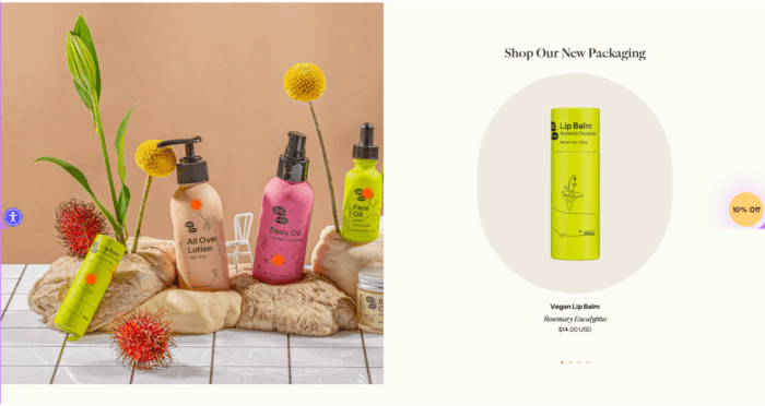
A shining example would be Meow Meow Tweet’s store – a haven for organic skincare enthusiasts who swear by their sole offering: an all-natural vegan deodorant stick. It may sound narrow, but focusing on one thing allowed them to dive deep into every detail about this specific product, hence becoming experts in the field, which translated well with consumers who seek quality over quantity.
Interestingly, many businesses thrive on this model despite being counter-intuitive at first glance (more products mean more sales, right?). Yet according to research findings, 18 successful single product websites were analyzed, including brands like Press Coffee and Pit Bulls Brand – they had something common: Their branding was spot-on with tone and visuals aligning perfectly with their values, thus creating distinct identities.
The Benefits Of Going Solo With Your Product
In our era where choice overload can lead us down endless scrolling rabbit holes (cue existential dread), simplicity can be blissful relief. One-product stores do away with overwhelming choices and focus on selling a single, high-quality product. This can help ensure the customers feel confident about their purchase decisions.
Just picture this: you’re scrolling through various stunning photo galleries. They feature perspective phone mockups, each showcasing detailed product aspects. Each image is a testament to how our unique approach elevates the singular item we offer.
Key Takeaway:
Single product websites are digital storefronts dedicated to showcasing and selling one item. They tell a compelling story about the product, making it easier for customers to decide. Businesses like Meow Meow Tweet thrive on this model, diving deep into every detail of their unique offering, creating stronger brand identities, and simplifying customer choices.
Exploring the Seattle Cider Co. Website
The Seattle Cider Co., a unique single product brand, offers an interesting example of effectively utilizing a single product website for maximum impact. It’s all about intuitive navigation and focusing on the high-quality product: cider.
Regarding design, Seattle Cider’s website takes a refreshing approach that makes you feel like you’ve walked into their actual store in Washington. The high-contrast colors used throughout their site are reminiscent of apples – crisp whites with splashes of green and reds reflecting their variety from standard ciders to small-batch specialties.
One thing that stands out is the social proof sections, where satisfied customers have left rave reviews about taste and delivery service. These testimonials serve as persuasive evidence supporting the quality they claim – making it easier for new visitors to trust them enough to try their products.
Prioritizing Benefits Over Features
Apart from showcasing beautifully designed bottles through professional-grade photography images, this online store highlights what sets its cider apart: pure ingredients without any concentrates or artificial flavors, gluten-free promise, sustainable production process, and year-round availability across multiple states—these features make every sip special.
Beyond just describing these attributes, each short but well-written description also explains why these things matter — providing benefits rather than simply listing off features that create more compelling content overall.
Product-Centered Design
This website focuses heavily on visuals—an important aspect when selling something people consume. By using a vibrant color scheme and eye-catching image sources such as photos depicting apples in different stages (from blossoming trees to ripe fruits), it brings forth transparency regarding the source of ingredients, giving an extra layer of trust.
But it doesn’t stop there. The site also uses perspective phone mockups to showcase its user-friendly app to locate stores carrying its products. It’s a clever way to integrate technology into the shopping experience and highlight how they’re modernizing the cider industry.
Social Proof
the pleasure of savoring their unique brews. These reviews are an excellent way to get a feel for the taste and quality that Seattle Cider Co. offers, straight from folks who’ve experienced it firsthand.
Single product website example: Seattle Cider Company

Key Takeaway:
Seattle Cider Co. masterfully uses its single product website to highlight the unique qualities of its cider. By focusing on benefits over features, showcasing high-quality visuals, and incorporating customer testimonials, they build trust with new visitors and reinforce their brand’s authenticity.
Unpacking the Success of Meow Meow Tweet
The beauty and personal care industry is teeming with brands, but Meow Meow Tweet, a single product brand, has carved out its niche. This New York-based company offers a unique line of vegan skincare products presented through an effective single product website..
Diving deeper into their website design reveals the success behind this quirky yet impactful name. The first striking feature that meets your eye on landing on their page is the playful color scheme, which perfectly complements their eccentric branding. From whimsical graphics to captivating product photography images, everything resonates with what they stand for – fun, natural, and sustainable skincare.
Fostering Brand Identity Through Design
A visit to the site showcases how well Meow Meow Tweet leverages flat cartoon animation as part of its user interface strategy. It’s not just about cute cats tweeting; it’s also about engaging customers visually while communicating important information in an entertaining way.
This brand knows how to use high-contrast colors effectively within its web layout. These strong visuals and easy-to-navigate menus ensure users have no trouble finding what they need – shopping for goods or learning more about this green-conscious enterprise.
Social Proof as A Trust-Building Tool
Beyond aesthetics, though, lies another critical component: social proof. Out of 18 successful single product websites analyzed, all emphasized building trust by showcasing real-life experiences from satisfied customers right on their homepage.
Like these stores, our feathered friend here also uses customer testimonials throughout its site. By doing so, potential buyers can easily see why Meow Meow Tweet’s products are worth their attention and investment.
Seamless Scrolling Experience
The website offers a seamless scrolling experience, guiding users through product features, customer testimonials, brand stories, and the purchase section. This flow is intuitive for visitors as they get acquainted with the brand in a storytelling format before purchasing.
So, what’s the end game? Combining practicality and imagination, this exploration journey is captivating and enjoyable.
Single product website example Meow Meow Tweet
Key Takeaway:
Moreover, Meow Meow’s Tweet cleverly builds trust. They do this by showcasing their dedication to quality and sustainability through engaging storytelling. This combination of playfulness and commitment is a powerful way they connect with customers on a deeper level.
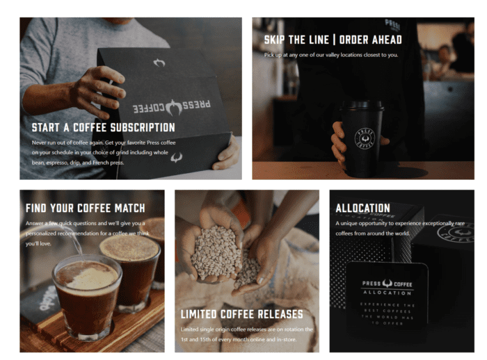
Press Coffee – A Case Study
The world of single product websites offers many unique and successful examples. But let’s take a closer look at one that stands out from the crowd: press coffee.
Press coffee as a Single Product Brand
Operating in an industry saturated with high-end coffee shops and giant retailers, Press Coffee carved its niche by offering another product and an experience. This approach made Press Coffee more than just another item on the shelf; it became a lifestyle choice for coffee enthusiasts.
A key to their success lies in the artful combination of minimalistic design, intuitive navigation, and well-written descriptions, all encapsulated within their beautiful website. It creates an immersive user journey which ultimately leads to conversion — turning visitors into customers.
Design and User Experience on Press Coffee’s Website
The website greets you with clean lines paired with high-contrast colors, focusing primarily on showcasing their single product: The beautifully designed press coffee. High-quality images are used throughout, allowing potential buyers to fall in love with this uniquely appealing kitchen gadget before they’ve even touched it.
What makes this online store even more impressive is how each element helps highlight what makes this brand special — from custom designs featuring perspective phone mockups to photo galleries filled with inspiring shots of people enjoying freshly brewed goodness straight from their palm press device. Every detail has been carefully considered and meticulously implemented, ensuring optimal browsing satisfaction.
Social Proof & Trust Building
Incorporating social proof into your website can work wonders for trust-building among consumers who may be hesitant about purchasing something without first seeing some validation or endorsement by others. And they have it in spades when it comes to the press coffee.
As you navigate their site, user testimonials are smartly placed within view, adding a human element and reassuring potential buyers of the quality and satisfaction others have experienced. The brand’s success is reflected through customer reviews – not just praising the product but sharing personal stories about how much better their mornings have become thanks to this little device.
The Art of Product Presentation
Let’s talk about the press coffee. It’s an essential tool for coffee lovers, perfect for making a rich and flavorful brew. Whether you’re new to this or have been using one for years, there’s always more to learn.
Single Product website: Press Coffee
Key Takeaway:
In-depth tutorials. Their approach doesn’t just focus on selling a product, but it also provides valuable insight into the art of coffee making. By turning an everyday routine into an experience, Press Coffee has brewed up a unique space in the market.
The Pit Bulls Brand – A Single Product Website Analysis
When you think of single product websites, one brand that may pop into your mind is the Pit Bulls brand. Known for its unique features and customer engagement strategies, it is a prime example in the world of one-product stores.
Pit Bull’s Successful Store Design and Unique Features
Let’s start with the store design. You’re greeted by high-quality product photography images when you land on their page. This immediate visual impact helps capture visitor attention while highlighting what makes this pit bull-related product special.
In addition to compelling imagery, Pit Bulls’ website uses an effective color scheme that reinforces its branding identity. Using high-contrast colors within their design elements has created a visually appealing user experience, which has undoubtedly contributed to their success.
Beyond aesthetics, though, lies functionality – more specifically, intuitive navigation. As part of our analysis at 99landingpages.com, we found this factor plays a significant role in ensuring visitors can easily find what they need without frustration or confusion – something Pit Bulls excel at.
A Deep Dive Into Their Customer Engagement Strategies
Pit Bulls isn’t just about looks; there are several clever tactics behind those charming visuals. One key strategy is how they incorporate social proof throughout the site. Customers who love their products aren’t shy about singing praises publicly, and these testimonials provide potential buyers with added confidence when making purchase decisions.
Another important aspect is how well-written descriptions accompany each item on offer – not just outlining technical details but weaving stories around them. From our perspective here at 99LandingPages, it’s clear that these tales help connect customers emotionally with both products and brands.
Lastly, the website focuses on providing an enjoyable scrolling experience. By ensuring seamless transitions and avoiding abrupt changes in content layout or color palette, they’ve crafted a browsing journey that keeps visitors engaged and interested for longer periods of time.
The Result: A Winning Single Product Website
Pit Bulls have nailed everything from quality product photos to well-written descriptions. They’ve created a unique shopping experience that’s both engaging and effective. Not only does their store look great, but it also performs impressively.
Single product website example: Pitbill

Key Takeaway:
Websites like Pit Bulls truly know the art of balancing compelling design with impactful customer engagement tactics. They draw in visitors using top-notch visuals, sprinkle a lively color palette for an eye-catching display, ensure user-friendly navigation, and craft narratives about their products to strike an emotional chord with customers. By offering a smooth browsing journey, they keep users hooked and turn their website into a winning platform.
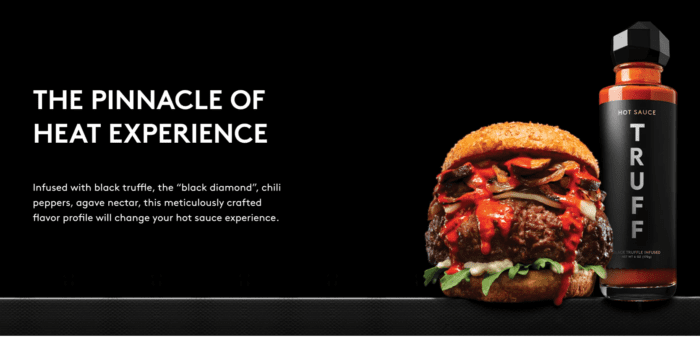
Truffle Hot Sauces – Examining a Successful Single Product Website
If you’re searching for single product website examples that sizzle, look no further than Truff’s truffle hot sauces. This site is a brilliant example of turning up the heat and engaging customers with just one unique product.
The key ingredient in Truff’s success? It’s their truffle-infused hot sauce and their beautifully designed store. With its sleek color scheme and high-quality product photography images, this single product website starts your mouth watering when you land.
Savoring the Unique Features of Truffles’ Store Design
In terms of user experience, this online shop delivers as much kick as its gourmet condiment. Its well-written description highlights what makes its truffle hot sauces special – combining spicy chilies with luxurious black truffles for an unexpected flavor fusion. But it doesn’t stop there; they use social proof sections featuring reviews from satisfied customers to give potential buyers more confidence in making a purchase decision.
One might argue that it’s not merely about selling a single product but presenting an entire brand narrative through imagery and storytelling elements like customer testimonials (or should we say ‘hot ’imonials?), thereby creating stronger connections between users and products.
A Spicy Blend of Simplicity and Sophistication
Another secret behind this successful single product website lies in its simplicity mixed with sophistication—just like blending fiery peppers with fancy fungi. The homepage features only necessary details—a brief intro to the star attraction (the sauce), compelling CTAs prompting visitors to join ‘The List,’ and options to buy now or explore more flavors.
This design choice lets shoppers focus on the product without any distractions. It’s like going to a restaurant and ordering their specialty dish; you know it’s been perfected, so why look at anything else?
Moreover, they have created an intuitive navigation system that allows customers to find what they need easily – be it detailed ingredient information or FAQs. This seamless browsing experience makes Truff a great example of how simplicity can make a single product website shine.
Single product website example: Truff
Key Takeaway:
Truff’s truffle hot sauces showcase how a single product website can sizzle successfully. The secret? A blend of simplicity and sophistication in design, engaging storytelling elements like customer testimonials, high-quality images, and clear product descriptions. Their well-crafted single product website not only sells their unique sauce but presents an entire brand narrative that resonates with customers.
Washington Apples – An Effective Single Product Website
If there’s one thing the Pipcorn website has shown us, it’s the power of high-quality images. Washington Apple’s single product website takes this lesson to heart. This is not just a store selling apples; it offers an experience centered around its unique product.
The primary feature setting apart Washington Apples as a single product brand is its ability to make something as simple as an apple seem extraordinary. Through stunning product photography and clever color schemes, they create a visual feast for visitors right from the moment the site loads.
This website showcases what makes their product special – small-batch ciders crafted with care from standard cider varieties grown in Seattle’s backyards. The beautifully designed homepage features full-screen photo galleries with vibrant images capturing their products and the orchards where these exquisite fruits are grown.
Social Proofing & User Experience: Setting New Standards
The well-written descriptions provide all you need to know about each variety of apple and cider offered by Washington Apples, but they don’t stop there. They let satisfied customers do some talking, too. Reviews and testimonials are powerful social proof elements bolstering credibility while helping potential buyers feel more confident in purchasing.
Beyond mere aesthetics, what sets this single product website apart is its commitment to providing an excellent user experience through an intuitive navigation design that guides visitors smoothly through various sections without overwhelming them with excessive information or choices.
Captivating Visuals & Consistent Brand Identity
From beautiful flat cartoon animations highlighting different aspects of apple cultivation process to perspective phone mockups showing how easy ordering via mobile can be, the website uses a variety of visual tools to keep users engaged.
Even more impressive is how all these elements are tied together by a consistent color palette and distinctly Washington Apples branding. The retro-looking logo, with its high-contrast colors, perfectly encapsulates the brand’s modern yet nostalgic appeal – an embodiment of their dedication to preserving traditional cider-making methods while leveraging modern technology for optimal quality control and customer service.
Single Product website example:Washington Apples
Key Takeaway:
Everything they need to make an informed decision. Their website is more than just a pretty face; it’s a robust platform that provides comprehensive information about their products, right down to the distinct flavor profiles of each cider. This commitment to transparency and quality has allowed Washington Apple to create not only a memorable online presence but also an authentic connection with apple enthusiasts around the world.
SmartCam Surveillance – Leveraging Single Product Websites for Success
If you’re seeking to maximize the potential of your single product website, look no further than SmartCam Surveillance. Their approach is a prime illustration of how design and user experience can be used to draw in customers and promote sales.
The heart and soul of any single product website starts with its branding, something that SmartCam has nailed down perfectly. The retro-looking logo sets an authoritative tone immediately, reinforcing trust in their high-end surveillance system.
Design That Appeals And Engages
A closer look at SmartCam’s website reveals meticulous attention to detail in its design. High-quality product photography images paired with well-written descriptions allow visitors a virtual hands-on experience before purchasing.
In line with other successful single product stores such as Meow Meow Tweet or Seattle Cider Co., it includes social proof sections where testimonials from satisfied customers affirm the value offered by this top-notch security solution.
Navigating With Ease
An intuitive navigation layout gives prospective buyers quick access to key information about this smart surveillance camera—what makes the product special, how it works, benefits over features—and so on—all without overwhelming them with too much text at once. Short descriptions and high-contrast colors make each section distinct yet cohesive as part of an overall story—a classic feature seen across all efficient single product websites like Truffle Hot Sauces or press coffee websites.
Focusing On A Single Product Brand Strategy
Like Washington Apples’ unique focus on showcasing standard cider variants while emphasizing small-batch cider uniqueness, Smartcam uses similar tactics to highlight its products. It showcases the surveillance camera’s unique features, like perspective phone mockups and user manuals—making it easier for customers to understand why this product fits their needs perfectly.
But what sets SmartCam Surveillance apart from other single product websites is its commitment to creating an immersive scrolling experience that effectively conveys the essence of its brand and makes its high-quality product stand out in today’s competitive market.
Key Takeaway:
SmartCam Surveillance from its competitors. With the perfect blend of superior branding, thoughtful design, and a customer-centric approach, it has truly set itself apart in the single product website sphere.
GoPro – A Case Study in Single Product Websites
Single product websites have a unique advantage: they focus entirely on one product, which lets them create an immersive shopping experience. One of the standout examples in this field is Go Pro, a single product website specializing in manufacturing action cameras.
The magic starts right from their homepage. The GoPro website offers high-end user experience and design elements that are hard to ignore. This includes intuitive navigation, making it easy for users to explore the product features and benefits without getting overwhelmed or lost.
GoPro is a Single Product Brand
Let’s dive into some specifics if you’re asking what makes GoPro’s brand special among other single product websites. First, using high-quality product photography images brings out the beauty of their cameras – each image and video perfectly captures its uniqueness and elegance.
Design Elements Enhancing User Experience on the GoPro Website
Moving beyond having great products isn’t enough anymore — brands need to offer more than ever when engaging customers online; today’s consumers demand top-notch experiences at every touchpoint during their buying journey. To meet such expectations, head-on successfully involves deploying innovative strategies like leveraging animation effects throughout the site layout along with incorporating subtle color scheme variations across different sections, thereby creating visually appealing yet cohesive aesthetic appeal overall, resulting not only increased traffic but also higher conversions ultimately leading towards better bottom-line results.
Another key element contributing to GoPro’s success is its strategic use of social proof. By displaying customer reviews and endorsements prominently, GoPro can demonstrate the appreciation their product has gained from users, increasing trustworthiness and boosting chances of purchases. This clever move enhances trust and makes potential buyers more likely to hit ‘shop now.’
Key Takeaway:
GoPro’s single product website shines by focusing on unique, smart action cameras. They use high-quality images and detailed descriptions to showcase the product. Their user-friendly design and engaging elements like animations and color variations create an immersive shopping experience. Prominent customer reviews provide social proof, enhancing trust and boosting sales.
Introducing the Power of Product Landing Page Template
While a single product website offers a dedicated space for showcasing the uniqueness of your product, there’s an equally compelling alternative that’s efficient, cost-effective, and tailor-made for targeted campaigns and lead generation – The Product Landing Page Template by 99 landing page.

Designed as standalone pages with a singular focus, this template provides a strategic solution for businesses aiming to run targeted campaigns and drive conversions without the overhead of a full website.
The Features Of The Product Landing Page Template
Cost-Effective Solution:
Say goodbye to the expenses associated with maintaining a full website. Product Landing Page Templates offer a budget-friendly alternative, allowing you to allocate resources more efficiently. Their simplicity reduces development and maintenance costs while still delivering a polished, professional online presence.
Easy Customization:
Designed with user-friendly interfaces, these templates are a breeze to customize. No coding expertise required – simply plug in your product details, images, and campaign specifics. This agility ensures that your landing page is up and running in no time, ready to capture leads and drive conversions.
Optimized for Conversions:
Every element of a Product Landing Page Template is strategically crafted to enhance conversions. From compelling headlines and persuasive copy to eye-catching visuals and clear calls-to-action, these templates prioritize the elements that drive customer actions, ensuring your campaigns yield optimal results.
The Product Landing Page Template is your digital campaign hub – a standalone powerhouse optimized for lead generation and conversions. Embrace the simplicity, cost-effectiveness, and customization prowess of these templates to amplify the impact of your product-focused campaigns.
FAQs about Single Product Website Examples
How do I create a website for one product?
To build a single product site, focus on your item. Use top-notch visuals, engaging descriptions, and simple navigation to spotlight it.
Do Single Product Websites Work?
Absolutely. Single product websites can boost sales by directing customer attention solely toward the featured item without distractions.
What is a single product store?
A single product store markets just one type of merchandise, often focusing deeply on its benefits and features to attract customers.
What is one brand and one product example?
An instance would be GoPro’s website – they primarily promote their flagship action cameras with unique branding strategies.
Conclusion
Embarking on this exploration of single product website examples, you’ve uncovered the secret sauce that makes these online stores thrive. :mag:
The simplicity of a single product store, like Seattle Cider Co., lets customers focus entirely on one offering, maximizing its appeal. It’s all about intuitive navigation and prioritizing benefits over features.
You’ve seen how brands like Meow Meow Tweet engage their audience with unique color schemes and compelling social proof sections. As exemplified by Washington Apples, you’ve discovered the power of high-quality images to elevate customer experience.
All in all, every pixel matters when crafting successful single product websites. Remember this golden rule: Make your product shine bright in the spotlight!
Read More:
5 Product Landing Page Ideas to Increase Your Conversions
Maximize Your Profits: Landing Page for Affiliate Marketing
Our Featured Templates:
Home Decor Landing Page Template